Zone Devlog #00 - Prelude
Hello there. I said in an earlier posts I had things to write off on this dusty place of a blog. Well, why not start with the biggest personal project I currently work on?
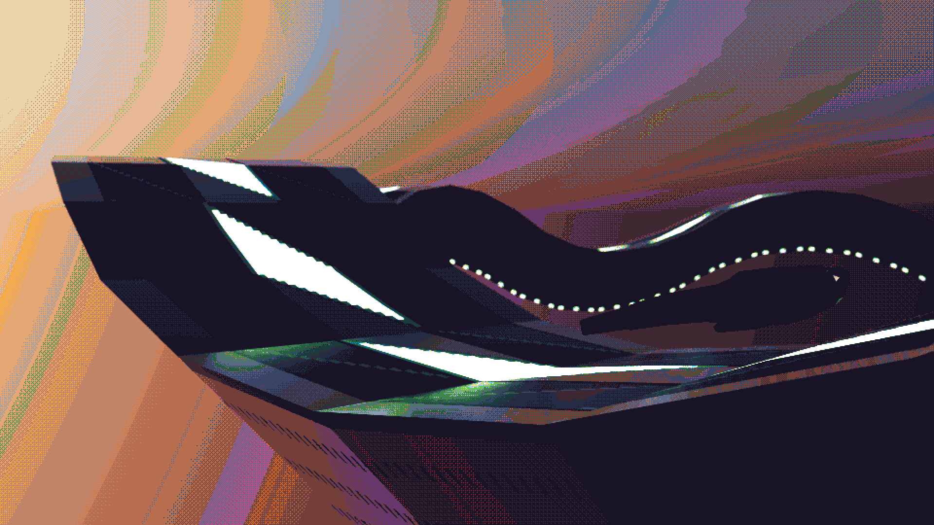
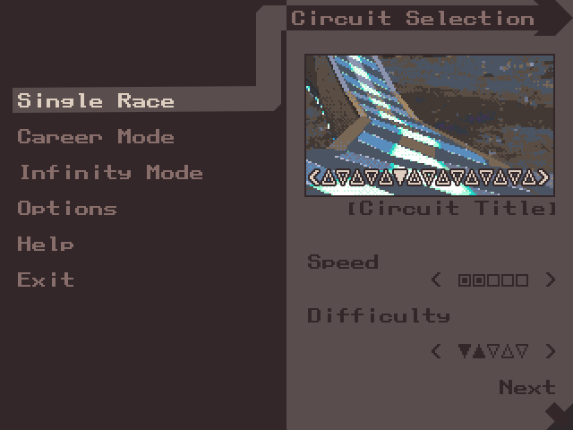
A mockup I designed to motivate myself. Leaving it here as an appetizer, because it's going to be a long post. Click on it for full resolution!
Down the Memory Lane
When I was a young child, I was “given” a PlayStation, “given” because I clearly remember my parents playing it, probably more than me. I had a small selection of games, mostly hand-me-downs from the same person who donned their console. To vote a few of them I remember from memory: Worms World Party, Bust-a-Move 4, Yoyo’s Puzzle Park, Digimon World, Wip3out Special Edition…
Bust-a-Move 4 was one of them, and you know how that ended up, right? Remake of the first game on a calculator, yup. Fun fact: I had a from-scratch total rework in the backlog a few months ago, as a test project for a game engine architecture idea. That’ll be the postmortem for another post. Stay tuned.
Circling the target
Let’s talk about another specific game in that previous list, Wip3out. I was clearly too young to understand how to play this game. Well, I understood about moving the ship but that was it. The icon on the top left corner of the screen -the weapon icon- when I passed that weird X shape was totally understandable for a 4 year-old child with less attention than a goldfish. Nor did I understand why the ship would stop by itself after a while (the arcade-styled gameplay timer). But the game still worked its place through my memory.
Fast forward a few years. The PSP is out and my father buys me one, white, for Christmas. I’m going to pass on the details on how I smashed the screen a few months later, but let’s talk about a little game I had among others with the console: Wipeout Pure.
In retrospective, Pure is probably one of the best Wipeout in the series, or at least one of the most complete one. For instance it had so many tracks. The game alone sported 8 tracks + 4 Classic tracks (remakes of older games’) + 4 Zone tracks (endless mode), but they went the extra mile and offered a wave of free DLCs adding 12 more circuits and 4 more Classic remakes, give or take due to region locking. You can’t possibly get tired of this game until a few dozen hours haha.
I was old enough to approach and enjoy Pure. And it’s probably the reason (with Pokémon) I didn’t end up with many PSP games: I played the crap out of it. I guess if I discovered the series with Wip3out, I ended up loving the series starting with that game. Even the demo Fired Up was played on for hours. Go figure.
A another self-motivating mockup. I hope you're not bored to death at this point.
I need to stop rambling here, sorry. Anyway, if you followed my antics in the last years, you should know my constant in most of my game projects: I always end up want to make a game in the veins of a series I loved. And almost everything went through it, Pokemon, Bust-a-Move, Mother 3… So, what was the logical conclusion? An antigravity racing game like Wipeout, of course! So many paragraphs to just say I’m working on a Wipeout clone.
Let’s talk about the project, shall we?
So, Wipeout it is. Racing games are something I haven’t done it yet. New kind of beast and problems. I’m already facing lots of issues in the programming field, specially regarding the physics and opponents. That’ll be the meat of the devlog’s post #01, this blog post is already way too long.
Let’s talk instead of the art style instead. Those days, I’d like to get close to the PS1’s look and feel. I’m working on both the game’s systems and the graphisms for once. I’m not definite on the final style, but I have a few mockups and works to develop my ideas.
A few words on the PS1
The Playstation was an interesting console graphics-wise. Instead of having floating-point1 coordinates for anything graphics related, they used 16-bit fixed-point2, making polygons’ vertices visually jump from a place to another, explaining the wobbly mess that was any mesh displayed on this console.
And if you complained about dynamic resolutions in modern console games, I’d suggest you to look away from this paragraph: the PS1 had multiple resolutions up to 640x480, but not so many games handled this resolution and downscaled to 320x240 while in-game. The funny bit comes from the fact that some games had different resolution if you were in a menu than if you’re in-game.
Textures on meshes were projected “incorrectly” regarding any kind of modern renderer. It uses
“affine texture projection” which costs cheaper than the “proper” projection, but is also the
cause of the texture wobbling you all love hate.
The last bit I’ll write on in this section is about bitdepth. The PS1 supported outputting 8-bit (256 colors), 15-bit( 32678 colors) or 24-bit (your classic non-HDR screen, 16'777'216 colors). Here again, not a lot of games used 24-bit colors for in-game, so they generally downscaled to 15-bit. And here they had a dithering option to simulate a bigger colorspace. On a CRT it doesn’t show that much, but if you take an emulator screenshot, you might end up with the grainy dither I love so much, hehehe.
Back on the art attack
I've been making *some* style research
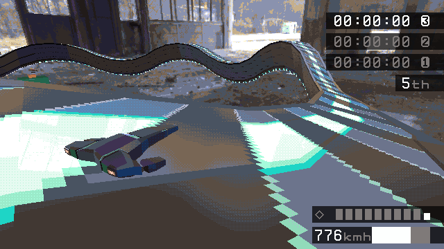
I’m currently chasing two main ideas for the in-race look: semi-realistic texturing and lighting but mushed with a good old color limited dithering and with low resolution textures or stylistic textures and lighting not far from Wipeout HD’s Zone mode.
But right now, the idea I’m pushing for right now is the semi-realistic one. I’d like to see some bastardized version of Physics-Based Rendering, but with an ugly dithering on the top of it, as if the receiving screen had a limited color palette. Maybe this will evolve in the future, but as of now, here’s what I’m looking for.
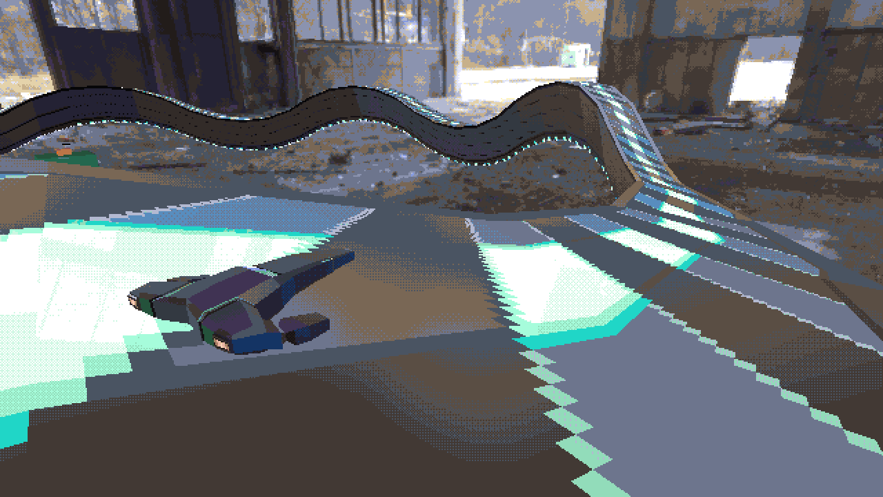
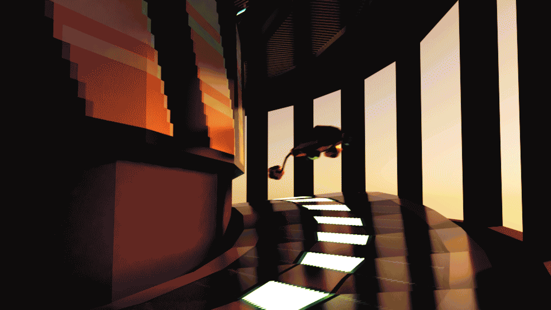
An early in-game screenshot, Click on the picture for a bigger version.
Sadly, I’m not a good graphist, even less when PBR is involved. You can see one iteration I’m more or less fine with until I get the Blender/Aseprite itch again.
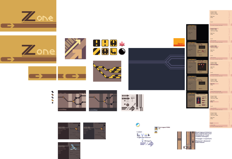
When it comes to menu or HUD, I’m still hesitating a lot. The earlier mockups were more inspired by Wip3out’s menu where the in-game HUD was more inspired from both a VCR’s menus and my old CRT TV’s settings menu. I found the perfect font, x14y24pxHeadUpDaisy, for this and the idea kinda was born by itself from that file.
The menu's third iteration.
The current idea for game HUD. I hope the VCR feeling is present.
Is this lore?
“Work, Buy, Consume, Die” - One of The Designer’s Republic quotes, who worked a lot on Wipeout games.
About the setting, I haven’t settled things up yet here either. I mostly drew mockup signs or brand advert panels, but nothing much more. I lack training on architecture and I’m starting to think I might need a few reference books or searches around the web to give myself enough inspiration to build over that. I have ideas regarding the series’ preference for the shiny idealistic high-tech future.
My current idea is going like Pure’s Descention mode (the equivalent of Ascension, but in the reverse order and with the additional 8 DLC tracks for a whopping 16-track Grand Chelem) and digging deeper and deeper, scraping off the idealistic as the game goes deeper to let a raw, rusty and rocky environment. Akin to Portal’s twist, to show the inner look of a “bright future”.
But beware, as I said previously, I don’t totally handle this idea right now. There is a lot of stuff to flesh out and variables to take account of, like what’s the core of the message I want to pass along. A few ideas are budding lately, but everything’s a blur and nothing’s definite is rising from the primordial soup. So, that’s probably a task for later.

Let’s finish with some more words
I think that’s a good part of the catch-up done here. We saw why I want to make such project,
how I want it to look and the possible ideas I want to develop in the game. The next post,
probably shorter, will be about the chain of failure decisions about the engine/programming
that made me come to this point. I should reserve also some blog space for the graphic part of
the engine, I found pretty interesting to look up on PBR stuff and want to delve on this, while
keeping a public track of my experiments, because why not?
Also I might do another retrospection in the future, hah. Talking about my PS1 games made me want to document a game less known (for once!) but that I own and I still enjoy.
See ya soon!
-
Floating-point numbers are similar storing numbers in the scientific notation, for instance 3.1415e-5, where are stored separately the significand -here 3.1415- the exponent -here -5- and the sign rahter than just storing the number itself if it can fit the number’s byte size. Here’s a better explanation than what I could write here there. ↩︎
-
Fixed-point is the floating-point cousin. it removes the concept of having an exponant part to just have an integer and a fractional part. The most common structure I have seen is storing a fixed in a 32bit integer, 16 bit for the integer part and 16 for the fractional, like in Pico-8. It allows a range of numbers from -32768 to 32768 with increments of 1/16. ↩︎